Bring home the warmth and intrigue of
Redend Point SW 9081

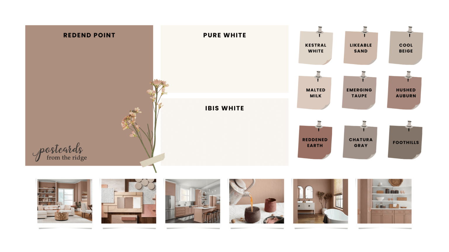
Embrace a spirit of connection with the world around us with this soulful-yet-subtle hue. Minimal yet cozy, this color creates a comforting backdrop for the everyday moments that matter. It is warm, inviting, rich, earthy hue that’s more neutral than you might think. It’s a rosy brown and has undertones of red, brown, and blue. It’s very reminiscent of a makeup palette with its soft, dark, blush tones.
How can I use Redend Point?
Depending how bold you are with your color choices in your home, there are various places it could be used. For many people, it’s not a favorite color for an entire room but would make a nice accent wall or look good in a small room.
As part of a larger color palette this color would be nice for bedding, pillows, wall art, throw blankets, and more. Here are some inspiration photos to see if it’s something you could use in your home.
- Kitchen Inspiration
- Livingroom Inspiration
- Bedroom Inspiration
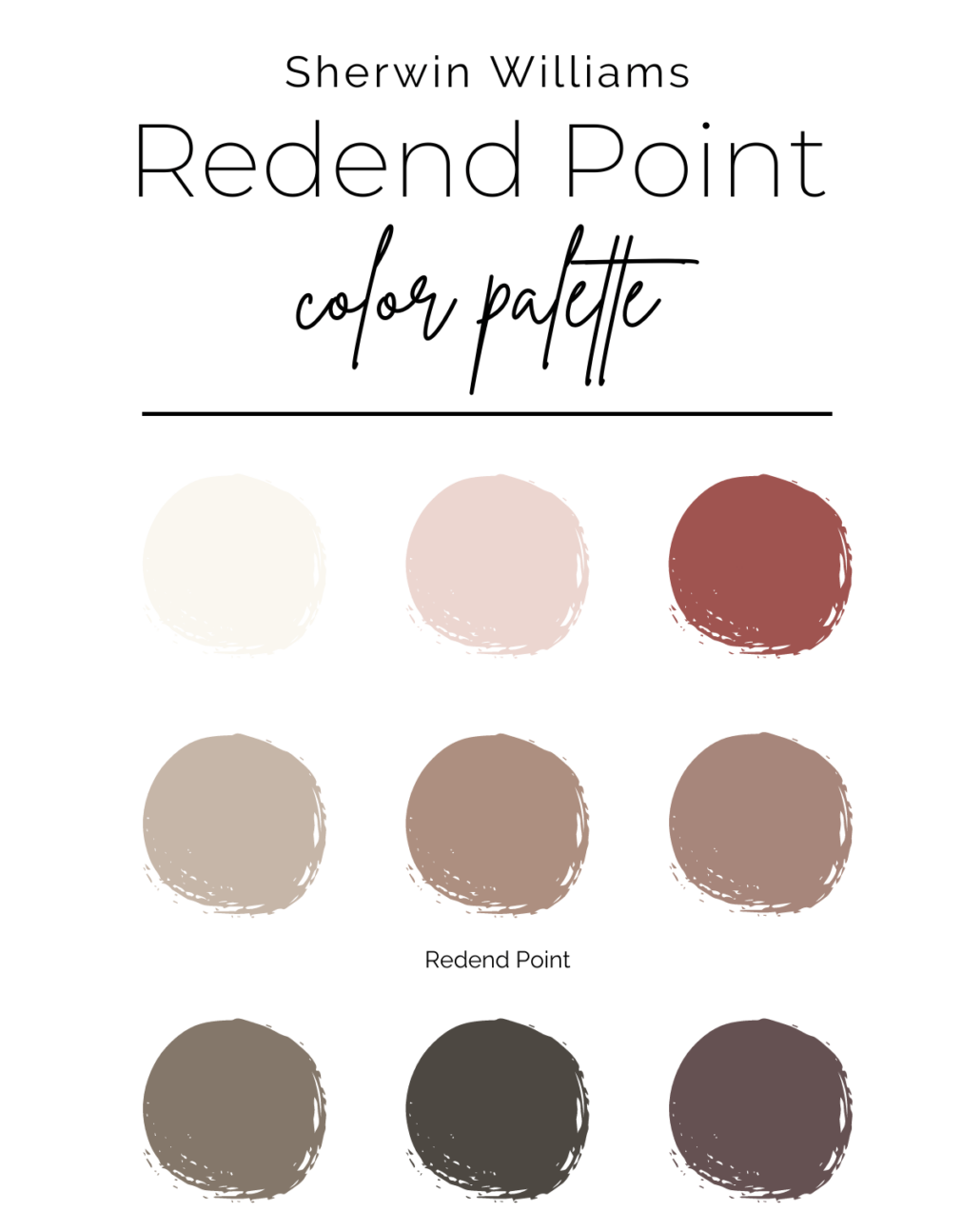
Colors that coordinate with Redend Point
There are a couple of different directions you could take this surprisingly neutral rosy tan. I’ve curated two different palettes including one that’s more monochromatic with lighter and darker versions, and another that has some complementary colors.
Final Thoughts on the 2023 Sherwin Williams color of the year
Have you ever wondered how the “color of the year” is chosen? Most of the choices are pretty popular, but this one is somewhat of an outlier. Whatever your thoughts about it are, you should always use what you love in your home. Your opinion is the only one that really matters!!
This color isn’t for everyone like other colors from past years. But in the right setting it could be stunning. What are your thoughts? Are you considering it for anywhere in your home?

 Facebook
 X
X
 Pinterest
 Copy Link


